Responsive HTML Tables
I am back with a weird hack. This one is inspired by a challenge on CodePen. The challenge was to make something interesting with tables. And one suggestion was to make it responsive. So I thought, why not give it a shot? And there I was doing something for nothing 😶. But it's okay. We should do that sometimes.
This challenge is pretty old for today when I am writing this blog. Actually, I have already made a youtube video but never got a chance to type it. But today, I am gonna do it. No matter what. You can check out the youtube video or simply read this. Totally up to you.
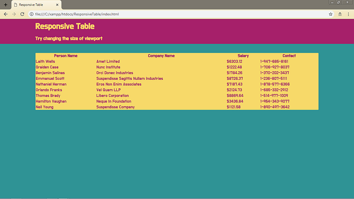
Let me show you what we are going to make. And since this is responsive, don’t forget to check this at different screen sizes.
Click on “EDIT ON CODEPEN” to open the live page. Then change the width of the output to see how the table changes without breaking at any point. You will notice that the table swiftly changes to a card format when there is less space to hold all the components of the table.
You can even have a look at the video tutorial which explains the page properly.
Before coding,
You would like to make a new folder for the project. Name it anything that you like.
Now make three files inside that folder:
- index.html
- main.css
- main.js
Or name them anything else that you like.
HTML part
Copy paste the code in your “index.html” or equivalent file.
If you are confused, follow the youtube video. I have clearly shown the whole process there.
I have attached the CSS and JS files here only so that I don’t have to come back to HTML again.
Right now the site should look something like this:

CSS part
You can read this part properly on CodePen. Here is the explanation:
In the main.css file, we will one by one start adding styles and see how it looks. But first, we are going to import a google font that I chose for this project. You can continue with any other font.
@import url(‘https://fonts.googleapis.com/css?family=Do+Hyeon');Now we will define colours in root using CSS Custom Properties. (NOTE: Internet Explorer does not support Custom Properties. These colours will not work there if used like this).
:root {
  --color1: #A6206A;
  --color2: #EC1C4B;
  —-color3: #F16A43;
  --color4: #F7D969;
  --color5: #2F9395;
}
I picked up one of the palettes from this page on Behance. And then I gave them names (or numbers).
body {
  margin: 0;
  background-color: var(--color5);
  color: var(--color1);
  font-family: “Do Hyeon”, sans-serif;
}
I have given a margin 0 to body, to remove the default margin and I have also given a background-colour to body and color to text. I have used the google-font for font-family and sans-serif for fallback.

header {
  width: 100%;
  color: var(--color4);
  background: var(--color1);
}
This block is used to style the header block. I have just given a 100% width to the header. And set the background and text color.

h1, h3 {
  margin: 0 auto;
  padding: 0.5rem 0;
  width: 80%;
}
This block is used to give style to h1 and h3. Here is a note from my side. Don’t use h3 without using h2. This is a bad practice (which I am doing in this project, but never do this). I have used h3 without using h2 just because this was not a serious project. And I did not want to change the size of any heading (but you should always change heading size if you need a smaller font, don’t follow me!!!). Other than that, I have given an 80% width to the headings and auto margins on both sides. When margin is set to auto, it centres the element with respect to the parent element. Since header had 100% width, now the left and right margins are auto-calculated as 10%.

table, td, th {
  border-collapse: collapse;
}
This part is easy, right? Okay. You may not notice it now but if you have ever observed a table, whenever we make borders in a table, there are actually two borders. We have collapsed those two lines to a single line.
table {
  background: var(--color4);
  margin: 5vh auto;
  width: 80%;
  border-radius: 2px;
}
This one is really easy, we have given the same width to the table so that it is aligned with the headings. So, you can even make a custom property for that. I have set the same margin for left and right, but this time, I have given a top and bottom margin so that the table does not touch the header or the bottom of the screen. I have given a very small border-radius so that the table does not look pointy, neither does it look very rounded.
td, th {
  padding: 0.5rem;
  text-align: left;
}
After giving some padding to all the cells, we get the following output. It looks so much light now. It looked very squeezed up in the previous image without padding.

Now let’s start making it responsive but before that, notice one thing. Since we have provided ‘-’ in contact numbers, when we will decrease the screen size, contacts will break and start fitting into two lines. To remove that, we will observe the point where it starts breaking. We will note the width of the 4th column at that point. And then we will set the min-width of that column.
For that, open Developer Tools by pressing [Ctrl] + [Shift] + i. Then open responsive mode by pressing [Ctrl] + [Shift] + m or click on the ‘Toggle device icon’ at the top of developer options. Your browser will start showing how your site looks on different devices. Change the size of the screen by dragging its left or right border and find the point when the 4th column starts breaking. Then increase the size of the screen by 1–2 pixels so that the column is not broken.
Now in that portion of developer tools where Styles is present, you will find Computed just to the right side of it. In Computed, you can see the computed styles of the selected element. Browse to the 4th cell of any row (its width will be equal to the width of the whole column). Find width in Computed and note down its value. In my case, it is ‘113px’.
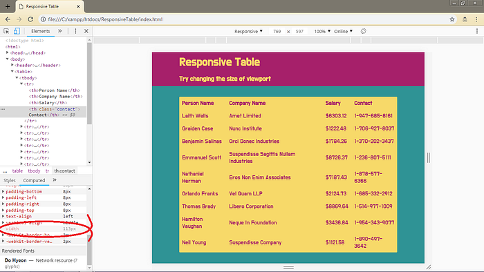
.contact {
  min-width: 115px;
}
I have set min-width to 115px instead of 113px because 115 looks better to me. There is no other reason. We can start with media-queries now. We need to first find out the width at which we will apply the media query. For that, change the size of the screen and find out where it starts breaking. In my case, it starts breaking at around 494px. So, I decided to apply it to 500px.
@media(max-width: 500px) {
  table {
    background: transparent;
    display: block;
  }
}
Here, I have set the display of table to block. This will help to maintain the 80% width of the table. This means, now the table will not break. And we have removed the background color because we will add the background color to td now.
Add the following code inside the media query.
  tr:first-child {
    display: none;
  }  tr {
    display: block;
    background: var( — color4);
    margin: 10px 0;
    border-bottom: 4px solid var( — color1);
    border-radius: 2px;
  }
Here we have removed the first row which contained table headings. For the rest of the rows, we have set the background that we removed from the table. We have set the display as block so that it also stops breaking. After this point, we can notice that we have started converting to cards. Then I have given some margin between all the cards. And I have given the same border-radius that we gave to the table, so that cards look similar to the table. I have also given a border-bottom to the card just for fancy looks.
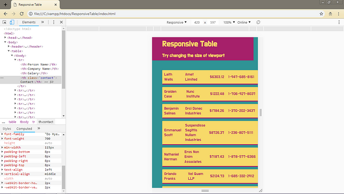
We have added the top-bottom margin to all the cards. We don’t need the top-margin before the 2nd row (1st row is hidden now). We also don’t need bottom margin after the last row.
  tr:nth-child(2) {
    margin-top: 0;
  }  tr:last-child {
    margin-bottom: 0;
  }  td {
    display: block;
    text-align: right;
  }
We changed the display of td from cell (default) to block. And we have aligned the text to right side. Because on the left side, we will have the labels. Now, if you notice carefully, you will see that there is less space above and below the fist and last text respectively on each card compared to the [space] in between the texts. This is because we gave 0.5rem padding to all the th’s and td’s before media query. To increase the space, we will reassign 1rem padding to the top of the first text and to the bottom of the last text.
  td:first-child {
    padding-top: 1rem;
  }  td:last-child {
    padding-bottom: 1rem;
  }

The site look likes this now. Looks pretty good till now. We just need to add the labels now and do some more changes in style and we will be done. So, let’s move to javascript first and then we will come back to CSS.
var tableHead = document.getElementsByTagName(‘th’);
var tableData = document.getElementsByTagName(‘td’);for (var i = 0; i < tableData.length; i++) {
  tableData[i].setAttribute(‘heading’, tableHead[(i % tableHead.length)].innerHTML);
}
Well, that is all. Haha! That was too easy. Okay, let me explain that to you. In Lines 1 and 2, we are accessing the table heads and table data (all the th and td) and making their arrays. So, tableHead and tableData variables are arrays.
If you try to print them on the console, you will see that there are 4 elements in tableHead because there are 4 th's in our HTML file. And we have 40 elements in tableData because we have 40 td's in HTML.
There is one more thing that should be noticed - 0th index element in tableData is the 'Name' of 1st person, 1st index element is the 'Company Name' of first-person, 2nd index element is 'Salary' of first-person, 3rd index element is 'Contact' of the first-person. This continues for the second person from 4th to 7th index, for the third person from 8th to 11th index and so on...
Our goal is to add a label to each element of td and we have noticed that we can do this by using ‘modulus’ function. This is what we do in lines 4 to 6. We have used a for loop to loop through all the elements of tableData. For each tableData, we add a custom attribute, heading, that corresponds to its tableHead. Some examples of attributes are, href, src, style, rowspan, colspan etc. Custom attributes are defined by the user. And the cool thing is, we can apply style to these attributes. Let's see how we do this.
This CSS code is also inside the media query.
  td:before {
    content: attr(heading);
    float: left;
    font-weight: bold;
    padding-right: 1em
  }
We are using the before selector to show the ‘heading’ that we made in javascript. content is used to show some text in before or after selectors. content is compulsory. attr is used to access the value of any attribute of the tag. We use bothElse everything is quite understandable.
So, this completes the code and your output will be same as mine.

That’s it for today. Please follow me for more such blogs. And don’t forget to clap
